
HTML & CSS tools

CSS effects generatorfor one element at a time

Choose a shadow, border, transform or filter. The preview and CSS show the current effect only.

CSS effects generator

Live preview

The colored tile is a sample. Its background is not included in the CSS output.

Current CSS

box-shadow: 0px 8px 24px 0px rgba(0, 0, 0, 0.18);

Parameters stay in this browser tab; no image or CSS is uploaded.

Effect parameters

Layer 1

Box shadow CSS is current.

A CSS effects generator helps when a card needs a softer shadow but copying isolated numbers from a design file hides how they interact. Adjust the layers against a visible tile, then take the exact box-shadow declaration into your stylesheet.

Use this CSS effects generator to compare a rounded border with a transform or filter without losing the settings in the other modes. Each mode keeps its values during this visit, while the export stays limited to the effect you are looking at.

Why use this CSS effects generator

Build one shadow from several layers

A box shadow generator with only one layer cannot show how a soft ambient shadow and a tighter contact shadow work together. Add up to four layers, adjust opacity independently, and see their comma-separated order in the CSS. Inset stays attached to its own layer.

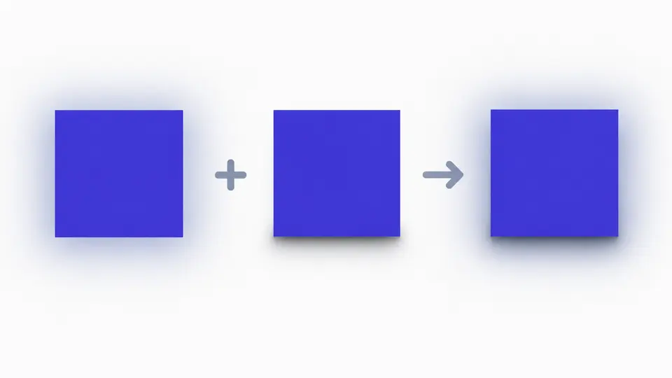
A colored tile casts two distinct soft shadow layers, with the combined result shown beside separate layer controls.

Keep each CSS effect in its own declaration

This CSS effects generator switches between the same tile's border, transform and filter controls while retaining each mode's values in memory. The code panel contains only the selected effect, so copying a filter never silently includes an old shadow or unrelated background color.

One sample tile appears with a rounded border, a rotation and a color filter as separate selectable effects.

Tune values you cannot judge from code alone

01

Layer shadows in the intended order

Start with the visible default shadow, then add a second layer for a smaller contact edge. Each layer has its own offset, blur, spread, color, opacity and inset setting. A negative spread shrinks the painted shadow instead of moving it.

02

Read the mode before copying

Link the corner values for one radius or unlink them for four. Transform functions are emitted as translate, rotate, scale, then skew; changing that order in your stylesheet changes the visual result. Neutral filters and transforms output none.

03

Let automatic CSS settle

After a parameter changes, export is disabled until the 350 ms update finishes. Turn automatic generation off to use Generate CSS or Ctrl/Cmd + Enter. Example, reset and layer removal show a preview and can be undone once.

Four visual controls, one focused output

Layered box shadows

Combine one to four outer or inset shadows. Each layer controls X/Y offset, blur, spread and alpha. The CSS uses one box-shadow declaration with a comma between layers, ready for a selected element.

Border plus independent corners

Set border width, style and color alongside border-radius. Link all four corners or give each one a pixel value. A zero-width border emits border: none while retaining the corner declaration.

Predictable transform order

Move, rotate, scale and skew the tile. The functions keep a fixed order in the output; scale 1 and zero movement, angle or skew are omitted. A fully neutral setting becomes transform: none.

Combined standard filters

Mix blur, brightness, contrast, saturation, grayscale, sepia, hue rotation, invert and opacity on the sample tile. Neutral controls disappear from the generated filter declaration.

CSS values and deliberate limits

Only the current effect is exported
The modes retain values while this page stays open, but the CSS download contains the selected declaration only. No selector, HTML, vendor prefix, saved project or share URL is generated. Add the declaration to your own rule.
Input stays within tested ranges
Shadow layers are limited to four, colors use six-digit hex input, and invalid or out-of-range numbers block export. Blur cannot be negative; shadow spread and offsets can. The panel reports the field that needs correction.
Filters affect the tile, not its backdrop
The filter mode does not emit backdrop-filter or drop-shadow. A CSS box shadow follows the element box, while filter: drop-shadow() can follow a nonrectangular image outline; they are not interchangeable.
No CSS import or animated scene
This page generates modern static declarations from controls. It does not parse pasted CSS, create keyframes, build a 3D flip card or export an image. The colored preview background is illustrative and is absent from the output.

CSS effects generator FAQ

Does it run in my browser?

Yes. The controls and CSS generation run in this browser tab. There is no CSS upload, image upload, account or saved history.

What can it generate?

It generates box-shadow, border with border-radius, transform or filter for the current mode. Choose a mode before copying; the download contains that mode's standard CSS declarations only.

Can I use RGBA or hex colors?

Enter a six-digit hex color and set opacity separately. The box shadow output combines them into an rgba() color; the border keeps the hex color. Raw RGBA text is not parsed.

Is the output standard CSS?

Yes. Copy declarations into your own selector. The generator does not add vendor prefixes, HTML or a stylesheet rule around them.

Is there a shadow box generator with a radius option?

Use the Border & radius mode for corners and the Box shadow mode for shadows. Both settings stay in the tab, but copy each current declaration separately; this tool does not merge modes into one snippet.

Found a CSS value that looks wrong?

Try the CSS effects generator on your next card

Adjust the sample tile, check the current declaration, and copy only the effect your component needs.