01
Start with a reversible preset
Choosing a new preset first opens a preview showing how many current points it will replace; Apply commits it and Undo restores your custom outline.
HTML and CSS tools
Drag polygon vertices or tune a basic shape, then inspect the generated CSS declaration.
clip-path: polygon(50% 0%, 93.3% 25%, 93.3% 75%, 50% 100%, 6.7% 75%, 6.7% 25%);Shape coordinates and CSS are generated locally in your browser.
CSS ready to copy.
A CSS clip-path generator helps when a straight rectangle cannot frame a badge, photo, or decorative section. Start with a hexagon, then move its points until the cut follows your design.
This CSS clip-path generator keeps polygon editing visual while showing the exact declaration you will paste into your stylesheet. It also covers circle, ellipse, and inset without turning them into fake polygons.
See the cut while editing coordinates, before pasting anything into a project.
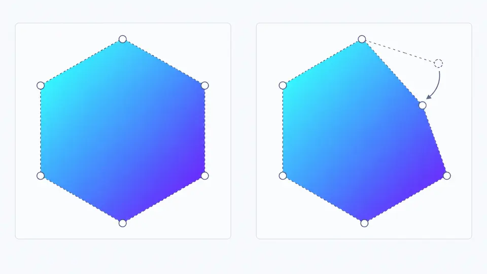
Drag any polygon point and watch the edge move against a patterned background. A point can also be selected and adjusted numerically, so the polygon clip-path editor stays useful for precise work.
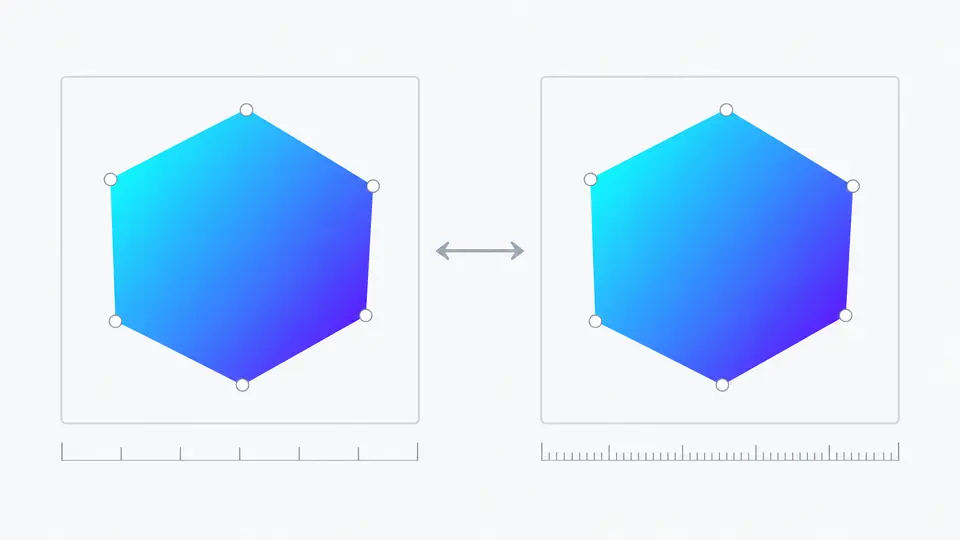
The same six points can be emitted as percentages or as pixels measured against a 320 × 320 reference box. The clip path maker keeps the preview fixed as you compare both outputs.
Choosing a new preset first opens a preview showing how many current points it will replace; Apply commits it and Undo restores your custom outline.
Click an edge marker to insert a midpoint. Select a vertex for X and Y fields, or drag it. Percentages scale with an element; px values use the stated 320 px box.
The automatic switch generates after a short pause. Turn it off to use Generate CSS or Ctrl/Cmd + Enter; copy and download stay disabled while the displayed code is stale.
Use polygon, circle, ellipse, or inset directly. Radius, center, edge offsets, and corner radius have their own controls.
Add a point on an edge, drag it, set exact coordinates, or preview deletion. A polygon always keeps at least three vertices.
Triangle, diamond, hexagon, star, and arrow give a head start; confirmation prevents a preset from silently replacing your custom work.
This CSS shape generator produces a standard clip-path declaration that you can copy or download as a CSS file.
Yes. Drag a visible vertex to reshape the polygon; the preview changes immediately. After a short pause, the CSS clip-path generator refreshes its declaration.
Select an edge marker or Add point to insert a midpoint. Select a vertex and choose Remove point to preview deleting one. Three points is the minimum.
This tool outputs the standard clip-path property only. If your project targets an engine that needs the prefixed spelling, add that declaration in your stylesheet after checking your support requirements.
clip-path masks the element’s own paint, including its box-shadow. To keep a visible shadow, apply the shadow to a surrounding wrapper instead.
polygon() draws straight segments between points. For a circle or ellipse use those shape modes; an arbitrary rounded polygon curve requires a different path-based approach.
Found a shape or coordinate edge case?
Try a preset, drag its points, and export a declaration that matches the live preview.
Keep this CSS clip-path generator handy when the next design calls for a custom polygon or simple geometric crop.
Generated in your browser.