01
Choose the layout system
Use Grid for named page regions and Flexbox for a row or column of items. Switching modes preserves both sets of settings.
- The first Grid example already has four rectangular named areas.
CSS layout tools
Choose Grid or Flexbox, adjust the canvas, and inspect the generated HTML and CSS together.
Choose the first cell, then the opposite corner.
.layout {
  display: grid;
  grid-template-columns: 1fr 1fr 1fr;
  grid-template-rows: auto auto auto;
  gap: 16px;
  grid-template-areas:
    "header header header"
    "sidebar main main"
    "footer footer footer";
}
.area-header { grid-area: header; }
.area-sidebar { grid-area: sidebar; }
.area-main { grid-area: main; }
.area-footer { grid-area: footer; }
@media (max-width: 640px) {
  .layout {
    grid-template-columns: 1fr;
    grid-template-rows: none;
    grid-template-areas: "header" "sidebar" "main" "footer";
  }
}
Layout settings stay in this browser tab; no upload or saved history.
Code and preview are current.
When a page shell needs a header, sidebar and main region, a CSS layout generator makes the two-dimensional map visible before you write selectors. The sample has three rows and three columns so you can inspect named areas immediately.
For navigation bars or item rows, switch the same CSS layout generator to Flexbox. Your Grid settings remain available when you return; this is more useful than rebuilding a second page from scratch.
The canvas and the exported rules describe the same structure.
Switch between a CSS Grid generator and a Flexbox generator without losing the other mode. A Grid page skeleton and a Flex item row can be compared in one workbench; each mode retains its own gap and alignment choices.
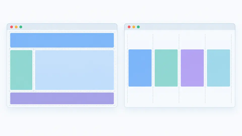
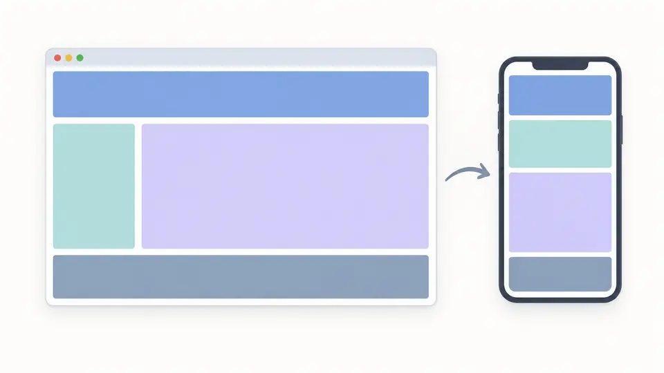
The responsive layout generator emits a real 640px media query. Desktop, tablet and mobile previews use the same HTML/CSS output, so a narrow preview is not merely a scaled picture.
Use Grid for named page regions and Flexbox for a row or column of items. Switching modes preserves both sets of settings.
Change each Grid track in fr, px, auto or minmax units. Pick an area, then select opposite corners to paint one rectangle; nonrectangular regions are rejected.
Set the preview to 390px and confirm the mobile stack. Copy CSS and HTML together, or download a standalone HTML file; exports stay disabled while settings are out of date.
Build grid-template-areas visually. The output includes matching grid-area rules for each child, so the HTML and CSS refer to the same names.
Set direction, wrapping, main-axis and cross-axis alignment, item count and gap. The live preview uses the browser’s actual layout engine.
A single mobile-stack preset adds a 640px media query and keeps the generated markup paired with the desktop rules.
Use Grid when rows and columns define a page structure; choose Flexbox when items flow along one axis. This CSS layout generator keeps both models on one page.
A named area is a map of cells in grid-template-areas. Repeating its name across adjacent cells makes one rectangular region, and the child receives a matching grid-area rule.
fr divides remaining space, px fixes a track width, and auto follows content size. The CSS Grid generator validates these values before exporting.
CSS requires one filled rectangle per area name. This canvas rejects an L-shaped or separated region rather than producing a declaration the browser would ignore.
Select mobile preview and leave the mobile-stack preset on. The resulting CSS layout generator output includes @media (max-width: 640px) and stacks the same HTML children.
Need another layout case?
Start from the sample, adjust the actual browser preview, then copy the generated CSS and HTML into your project.