01
Choose the reference before converting
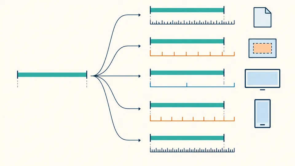
Root and parent font sizes are separate: rem uses the former and em uses the latter. vw and vh use the entered viewport width and height, not this tab’s current window.
HTML / CSS / Frontend Code
Enter a CSS length, or switch to clamp, calc or aspect ratio without leaving this page.
Your values are calculated in this browser and are not uploaded.
24px1.5rem1.5em1.6667vw2.6667vhCalculation ready.
A CSS unit converter helps when a design file says 24px but your stylesheet uses rem or viewport units. A px to rem converter alone cannot tell you what 1em or 2vw means until you specify the parent font and viewport. Set those values here before copying a number.
Use the CSS clamp calculator when you have two viewport and size pairs. The vw vh calculator view also makes each percentage of the viewport concrete. This CSS unit converter keeps the same context when you test a restricted calc() expression, so the numbers can be checked against one another.
The reference values stay visible instead of hiding behind a default.
The CSS unit converter shows px, rem, em, vw and vh for the same length. Change the root size and only rem changes; change the parent size and only em changes. The result is a calculation for the context you entered, not a claim about every page.
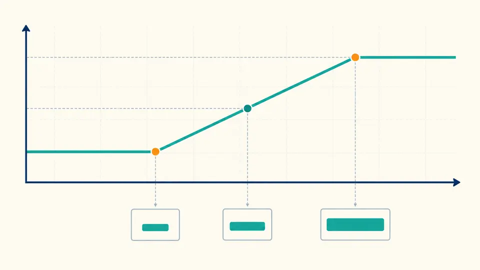
The clamp mode takes 16px at 375px and 32px at 1440px, then derives the middle vw term. Preview a width such as 768px to see its computed size and whether the value is still fluid or already clamped.
Root and parent font sizes are separate: rem uses the former and em uses the latter. vw and vh use the entered viewport width and height, not this tab’s current window.
Each mode retains its last input. Automatic calculation waits 350 ms after changes; turn it off to run with Ctrl/Cmd+Enter. A changed input makes the previous output unavailable for copying.
In clamp mode, preview an intermediate width and compare it with both endpoint sizes. In ratio mode, check the reduced width:height pair and the height computed for your target width.
Enter one px, rem, em, vw or vh length and read all five equivalents. A bare number is treated as px, and each result retains its unit.
Two viewport widths and two sizes determine a straight line. Choose rem or px bounds, and inspect the resulting clamp() expression and preview size.
Evaluate arithmetic with px, rem, em, vw and vh into pixels. Lengths may be added or subtracted; multiplication and division need a unitless factor.
Reduce integer width and height to a ratio, generate aspect-ratio CSS, and derive the height for a chosen target width.
Divide pixels by the root font size. At 16px per rem, 24px is 1.5rem; change the root field if your project uses another base.
rem follows the root element; em follows the font size supplied for the local context. Nested components can therefore yield a different em result even when rem stays fixed.
1vw is 1% of viewport width and 1vh is 1% of viewport height. Enter both dimensions first, then convert through px; a viewport change alters the result.
Give the minimum and maximum viewport widths and the sizes desired at those widths. The CSS clamp calculator derives a linear vw term and shows a preview at your chosen width.
Only the supported subset. You can evaluate calc(1rem + 2vw), but percentages, variables and browser-dependent functions have no reliable px value here.
Still have a question?
Return to the workbench to compare a length, test a formula or generate a bounded fluid size.